19 M6U: Unicorns, Janitors, and Rock Stars
This chapter draws on material from:
- 5. Unicorns, Janitors, Ninjas, Wizards, and Rock Stars by Catherine D’Ignazio and Lauren Klein, licensed under CC BY 4.0.
- Machine learning’s crumbling foundations by Cory Doctorow, licensed under CC BY 4.0.
Changes to the source material include light editing, adding new material, deleting original material, combining matieral, rearranging material, changing the citation style, adding links, replacing images, changing original authors’ voice to third person, and adding first-person language from current author.
The resulting content is licensed under CC BY 4.0.
19.1 Introduction
In Spring 2017, Bloomberg News ran an article with the provocative title “America’s Rich Get Richer and the Poor Get Replaced by Robots” (Giudice & Lu, 2017). Using census data, the authors reported that income inequality is widening across the nation. San Francisco is leading the pack, with an income gap of almost half a million dollars between the richest and the poorest twenty percent of residents. As in other places, the wealth gap has race and gender dimensions. In the Bay Area, people of color earn sixty-eight cents for every dollar earned by White people, and 59 percent of single mothers live in poverty (National Equity Atlas, 2018). San Francisco also has the lowest proportion of children to adults in any major US city, and—since 2003—an escalating rate of evictions.
Although the San Francisco Rent Board collects data on these evictions, it does not track where people go after they are evicted, how many of those people end up homeless, or which landlords are responsible for systematically evicting major blocks of the city. In 2013, the Anti-Eviction Mapping Project (AEMP) stepped in. The initiative is a self-described collective of “housing justice activists, researchers, data nerds, artists, and oral historians.” It is a multiracial group with significant, though not exclusive, project leadership by women. The AEMP is mapping eviction, and doing so through a collaborative, multimodal, and—yes—quite messy process.
If you visit antievictionmap.com, you won’t actually find a single map. There are several maps linked from the homepage: maps of displaced residents, of evictions, of tech buses, of property owners, of the Filipino diaspora, of the declining numbers of Black residents in the city, and more. The AEMP has a distinct way of working that is grounded in its stated commitment to antiracist, feminist, and decolonial methodologies (Anti-Eviction Mapping Project, 2016). Most of the projects happen in collaboration with nonprofits and community-based organizations. Additional projects originate from within the collective. For example, the group recently published an atlas of the Bay Area called Counterpoints: A San Fancisco Bay Area Atlas of Displacement & Resistance (Anti-Eviction Mapping Project, 2021), which covers topics such as migration and relocation, gentrification and the prison pipeline, Indigenous and colonial histories of the region, and speculation about the future.
One of the AEMP’s longest-standing collaborations is with the Eviction Defense Collaborative (EDC), a nonprofit that provides court representation for people who have been evicted. Although the city does not collect data on the race or income of evictees, the EDC does collect those demographics, and it works with 90 percent of the tenants whose eviction cases end up in San Francisco courts (Eviction Defense Collaborative, 2016). In 2014, the EDC approached the AEMP to help produce its annual report and in return offered to share its demographic data with the organization. Since then, the two groups have continued to work together on EDC annual reports, as well as additional analyses of evictions with a focus on race. The AEMP has also gone on to produce reports with tenants’ rights organizations, timelines of gentrification with Indigenous students, oral histories with grants from anthropology departments, and murals with arts organizations, as well as maps and more maps.
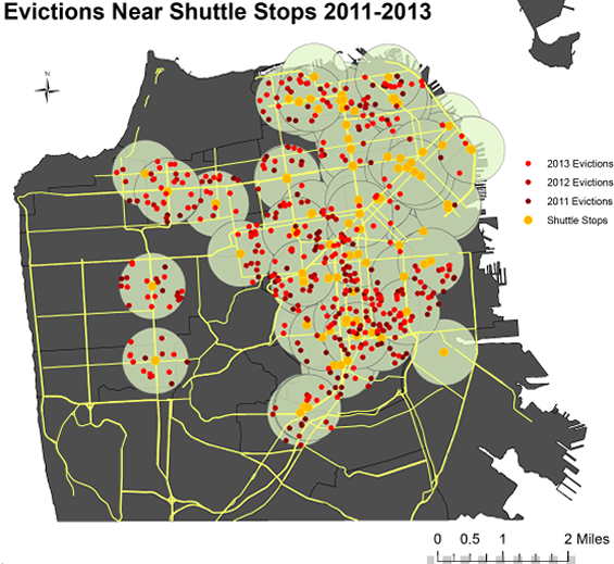
Some of the AEMP’s maps are designed to leverage the ability of data visualization to make patterns visible at a glance. For example, the Tech Bus Stop Eviction Map produced in 2014 plots the locations of three years of Ellis Act evictions (Anti-Eviction Mapping Project, n.d.-a). This is a form of “no-fault” eviction in which landlords can claim that they are going out of the rental business. In many cases, this is so that they can convert the building to a condominium and sell the units at significant profit. San Francisco has seen almost five thousand invocations of the Ellis Act since 1994. On the map, the AEMP plotted Ellis Act evictions in relationship to the location of technology company bus stops. Starting in the 2000s, tech companies with campuses in Silicon Valley began offering private luxury buses as a perk to attract employees who wanted to live in downtown San Francisco but didn’t want the hassle of commuting. Colloquially known as “the Google buses” because Google was the most visible company to implement the practice, these vehicles use public bus stops—illegally at first—to shuttle employees to their offices in comfort (and also away from the public transportation system, which would otherwise reap the benefits of their fares; see Solnit, 2013). Because a new, wealthy clientele began to seek condos near the bus stops, property values soared—and so did the rate of evictions of long-time neighborhood residents. The AEMP analysis showed that, between 2011 and 2013, 69 percent of no-fault evictions occurred within four blocks of a tech bus stop. The map makes that finding plain.
19.2 Intentionally Challenging Data Visualization
But other AEMP maps are intentionally designed not to depict a clear correlation between evictions and place. In Narratives of Displacement and Resistance (Anti-Eviction Mapping Project, n.d.-a), five thousand evictions are each represented as a differently sized red bubble, so the base map of San Francisco is barely visible underneath. On top of this red sea, sky-blue bubbles dot the locations where the AEMP has conducted interviews with displaced residents, as well as activists, mediamakers, and local historians. Clicking on a blue bubble sets one of the dozens of oral histories in motion—for instance, the story of Phyllis Bowie, a resident facing eviction from her one-bedroom apartment. “I was born and raised in San Francisco proudly,” she begins. Bowie goes on to recall how she returned from the Air Force and worked like crazy for two years at her own small business, building up an income record that would make her eligible for a lease-to-own apartment in Midtown, the historically Black neighborhood where she had grown up. In 2015, however, the city broke the master lease and took away the rent control on her building. Now tenants like Bowie, who moved there with the promise of homeownership, are facing skyrocketing rents that none of them can afford. Bowie is leading rent strikes and organizing the building’s tenants, but their future is uncertain.
This uncertainty is carried over into the design of the map, which uses a phenomenon that is often discouraged in data visualization—occlusion—to drive home its point. Occlusion typically refers to the “problem” that occurs when some marks (like the eviction dots) obscure other important features (like the whole geography of the city). But here it underscores the point that there are very few patterns to detect when the entire city is covered in big red eviction bubbles and abundant blue story dots. Put another way, the whole city is a pattern, and that pattern is the problem—much more than a problem of information design.
In this way, the Narratives map enacts dissent from San Francisco city policies in the same way that it enacts dissent from the conventions of information design. It refuses both the clarity and cleanliness associated with the best practices of data visualization and the homogenizing and “cleanliness” associated with the forces of gentrification that lead to evictions in the first place (see Naegler, 2012). The visual point of the map is simple and exhortative: there are too many evictions. And there are too many eviction stories. The map does not efficiently reveal how evictions data may be correlated with Bay Area Rapid Transit (BART) stops, income, Google bus stops, or any other potential dimensions of the data. Even finding the Narratives map is difficult, given the sheer number of maps and visualizations on the AEMP website. There is no “master dashboard” that integrates all the information that the AEMP has collected into a single interface. But all these design choices reinforce the main purpose of the AEMP: to document the effects of displacement and to resist it through critical and creative means.
The AEMP thus offers a rich set of examples of feminist counterdata collection and countervisualization strategies. Individually and together, the maps illustrate how Katie Lloyd Thomas, founding member of the feminist art architecture collective taking place, envisions “partiality and contestation” taking place in graphical design. “Rather than tell one ‘true’ story of consensus, [the drawing/graphic] might remember and acknowledge multiple, even contradictory versions of reality,” she explains (Thomas, 2016). The Narratives map populates its landscape with these contradictory realities. It demonstrates that behind each eviction is a person—a person like Bowie, with a unique voice and a unique story. The voices we hear are diverse, multiple, specific, divergent— and deliberately so.
In so doing, the Narratives map, and the AEMP more generally, exemplify another feminist principle of data science: embrace pluralism. Embracing pluralism in data science means valuing many perspectives and voices and doing so at all stages of the process—from collection to cleaning to analysis to communication. It also means attending to the ways in which data science methods can inadvertently work to suppress those voices in the service of clarity, cleanliness, and control. Many of our received ideas about data science work against pluralistic meaning-making processes, and one goal of data feminism is to change that.
19.3 Sexy Scientists and… Drab Janitors?
Data cleaning holds a special kind of mythos in data science. “It is often said that 80% of data analysis is spent on the process of cleaning and preparing the data,” writes Hadley Wickham (2014) in the first sentence of the abstract of “Tidy Data,” his widely cited paper. Wickham is also the author of the tidyr package for R, which we’ll work with later this week. Wickham’s package shares the sentiment expressed in his paper: that data are inherently messy and need to be tidied and tamed. As we’ve already learned, Wickham went on to create the “tidyverse,” an expanded set of packages that formalize a clear workflow for processing data, which have been developed by a team of equally enthusiastic contributors.
Articles in the popular and business press corroborate this insistence on tidiness, as well as its pressing need. In Harvard Business Review, the work of the data scientist is glorified in terms of this tidying function: “At ease in the digital realm, they are able to bring structure to large quantities of formless data and make analysis possible” (Davenport & Patil, 2012). Here, the intrepid analyst wrangles orderly tables from unstructured chaos. According to the article, it’s “the sexiest job of the 21st century.”
Along these same lines, people who work with data are often called unicorns (because they are rare and have special skills), wizards (because they can do magic), ninjas (because they execute complicated, expert moves), or rock stars (because they outperform others). However, the data analyst’s work is sometimes described as far less attractive. A 2014 article equated the task of cleaning data to the low-wage maintenance work of “janitors” (Lohr, 2014).
This kind of classist comparison overlooks how undervalued the latter kind of work is (whether it’s janitorial or data cleaning). Obtaining good data and/or cleaning up bad data is tedious, repetitive grunt-work. It’s unglamorous, time-consuming, and low-waged. Cleaning data is the equivalent of sterilizing surgical implements–vital, high-skilled, and invisible unless someone fails to do it. It’s work performed by anonymous, low-waged adjuncts to the surgeon, who is the star of the show and who gets credit for the success of the operation.
The title of a Google Research team (Sambasivan et al., 2021) paper beautifully summarizes how this is playing out in machine learning, one major application of data science: “Everyone wants to do the model work, not the data work: Data cascades in high-stakes AI.” The paper analyzes machine learning failures from a cross-section of high-stakes projects (health diagnostics, anti-poaching, etc) in East Africa, West Africa and India. They trace the failures of these projects to data-quality, and drill into the factors that caused the data problems.
The failures stem from a variety of causes. First, data-gathering and cleaning are low-waged, invisible, and thankless work. Front-line workers who produce the data —like medical professionals who have to do extra data-entry—are not compensated for extra work. Often, no one even bothers to explain what the work is for. Some of the data-cleaning workers are atomized pieceworkers, such as those who work for Amazon’s Mechanical Turk, who lack both the context in which the data was gathered and the context for how it will be used. This data is passed to model-builders, who lack related domain expertise. The hastily labeled X-ray of a broken bone, annotated by an unregarded and overworked radiologist, is passed onto a data scientist who knows nothing about broken bones and can’t assess the labels.
This is an age-old problem in automation, pre-dating computer science and even computers. The “scientific management” craze that started in the 1880s saw technicians observing skilled workers with stopwatches and clipboards, then restructuring the workers’ jobs by fiat. Rather than engaging in the anthropological, interpretive work that Clifford Geertz called “thick description,” the management “scientists” discarded workers’ qualitative experience, then treated their own positivist assessments as quantitative and thus authoritative.
Bad data make bad models. Bad models instruct people to make ineffective or harmful interventions. Those bad interventions produce more bad data, which is fed into more bad models—it’s a “data-cascade.” GIGO (Garbage In, Garbage Out) was already a bedrock of statistical practice before the term was coined in 1957. Statistical analysis and inference cannot proceed from bad data.
Producing good data and validating datasets are the kind of unsexy, undercompensated maintenance work that all infrastructure requires—and, as with other kinds of infrastructure, it is undervalued by journals, academic departments, funders, corporations, and governments. But all technological debts accrue punitive interest. The decision to operate on bad data because good data is in short supply isn’t like looking for your car-keys under the lamp-post—it’s like driving with untrustworthy brakes and a dirty windscreen.
19.4 Strangers in the Dataset
It’s pretty clear that we ought to value data cleaning more (both in terms of the language we use and the money we pay). Data cleaners must be able to tame the chaos of information overload. They must “scrub” and “cleanse” dirty data. And they must undertake deliberate action—either extraordinary or mundane—to put data back in their proper place. However, it’s also worth being more critical about assumptions and anxieties about the need for tidiness, cleanliness, and order.
But what might be lost in the process of dominating and disciplining data? Whose perspectives might be lost in that process? And, conversely, whose perspectives might be additionally imposed? The ideas expressed by Wickham, and by the press, carry the assumption that all data scientists, in all contexts, value cleanliness and control over messiness and complexity. But as the example of the AEMP demonstrates, these are not the requirements, nor the goals, of all data projects.
In fact, Rawson and Muñoz (2019) caution that cleaning can function as a “diversity-hiding trick” (p. 290). In the perceived “messiness” of data, there is actually rich information about the circumstances under which it was collected. Data studies scholar Yanni Loukissas (2019) concurs. Rather than talking about datasets, he advocates that we talk about data settings—his term to describe both the technical and the human processes that affect what information is captured in the data collection process and how the data are then structured.
As an example of how the data setting matters, Loukissas tells the story of being at a hackathon in Cambridge, Massachusetts, where he began to explore a dataset from the Clemson University Library, located in South Carolina. He stumbled across a puzzling record in which the librarian had noted the location of the item as “upstate.” Such a designation is, of course, relational to the place of collection. For South Carolinians, upstate is a very legible term that refers to the westernmost region of the state, where Clemson is located. But it does not hold the same meaning for a person from New York, where upstate refers to its own northern region, nor does it hold the same meaning for a person sitting at a hackathon in Massachusetts, which does not have an upstate part of the state.
Had someone at the hackathon written the entry from where they sat, they might have chosen to list the ten or so counties that South Carolinians recognize as upstate, so as to be more clearly legible to a wider geographic audience. But there is meaning conveyed by the term that would not be conveyed by other, more general ways of indicating the same region. Only somebody already located in South Carolina would have referred to that region in that way. From that usage of the term, we can reason that the data were originally collected in South Carolina. This information is not included elsewhere in the library record.
It is because of records like this one that the process of cleaning and tidying data can be so complicated and, at times, can be a destructive rather than constructive act. One way to think of it is like chopping off the roots of a tree that connects it to the ground from which it grew. It’s an act that irreversibly separates the data from their context.
We might relate the growth of tools like tidyr that help to trim and tidy data to another human intervention into the environment: the proliferation of street names and signs that transformed the landscape of the nineteenth-century United States. Geographer Reuben Rose-Redwood (2008) describes how, for example, prior to the Revolutionary War, very few streets in Manhattan had signs posted at intersections. Street names, such as they existed, were vernacular and related to the particularity of a spot—for example, “Take a right at the red house.”
But with the increased mobility of people and things—think of the postal system, the railroads, or the telegraph—street names needed to become systematized. Rose-Redwood calls this the production of “legible urban spaces.” Then, as now, there is high economic value to legible urban spaces, particularly for large corporations (we’re looking at you, Amazon) to deliver boxes of anything and everything directly to people’s front doors. This is a point that Rose-Redwood makes with respect to the nineteenth century as well. It wasn’t just the mail carrier who needed these signs. Rather, the street names were for the “stranger, merchant, or businessman”—this from an 1838 Philadelphia business directory—who came from elsewhere to operationalize a new landscape in the service of their own profit.
The point here is that one does not need street names for navigation until one has strangers in the landscape. Likewise, many data do not need cleaning until there are strangers in the dataset. The Clemson University Library dataset was perfectly clear to Clemson’s own librarians. But once hackers in Cambridge get their hands on it, upstate started to make a lot less sense, and it was not at all helpful in producing, for instance, a map of all the library records in the United States. Put more generally, once the data scientists involved in a project are not from within the community, once the place of analysis changes, once the scale of the project shifts, or once a single dataset needs to be combined with others—then we have strangers in the dataset.
These rock stars and ninjas are strangers in the dataset because, like the hackers in Cambridge, they often sit at one, two, or many levels removed from the collection and maintenance process of the data that they work with. This is a negative externality—an inadvertent third-party consequence—that arises when working with open data, application programming interfaces (APIs), and the vast stores of training data available online. These data appear available and ready to mobilize, but what they represent is not always well-documented or easily understood by outsiders. Being a stranger in the dataset is not an inherently bad thing, but it carries significant risk of what renowned postcolonial scholar Gayatri Spivak (2010) calls epistemic violence—the harm that dominant groups like colonial powers wreak by privileging their paradigms and ways of knowing over local and Indigenous ways.
19.6 Conclusion
What might be gained if we not only recognized but also valued the fact that data work involves multiple voices and multiple types of expertise? What if producing new social relationships—increasing community solidarity and enhancing social cohesion—was valued (and funded) as much as acquiring data? This could lead to a multiplication of projects like the AEMP: projects that do demonstrable good with data and do so together with the communities they seek to support.
19.7 References
Aiello, D., Bates, L., Graziani, T., Herring, C., Maharawal, M. McElory, E. Phan, P., & Purser, G. (2018, August 22). Eviction lab misses the mark. ShelterForce. https://shelterforce.org/2018/08/22/eviction-lab-misses-the-mark/
Anti-Eviction Mapping Project (2016). About/Acerca De Nosotros. https://www.antievictionmap.com/about
Anti-Eviction Mapping Project (2021). Counterpoints: A San Francisco Bay Area atlas of displacement & resistance. PM Press.
Anti-Eviction Mapping Project (n.d.-a). Narratives of displacement and resistance. http://www.antievictionmappingproject.net/narratives.html
Anti-Eviction Mapping Project (n.d.-b). Tech bus stops and no-fault evictions. https://www.antievictionmappingproject.net/techbusevictions.html
Data USA. (n.d.). Janitors & building cleaners: Race & ethnicity. https://datausa.io/profile/soc/janitors-building-cleaners
Davenport, T. H., & Patil, D. J. (2012). Data scientist: The sexiest job of the 21st century. Harvard Business Review. https://hbr.org/2012/10/data-scientist-the-sexiest-job-of-the-21st-century
Eviction Defense Collaborative. (2016). City of change: Fighting for San Francisco’s vanishing communities. http://www.antievictionmappingproject.net/EDC_2016.pdf
Giudice, V. D., & Lu, W. (2017, April 26). America’s rich get richer and the poor get replaced by robots. Bloomberg.com. https://www.bloomberg.com/news/articles/2017-04-26/america-s-rich-poor-divide-keeps-ballooning-as-robots-take-jobs
Lohr, S. (2014, August 17). For big-data scientists, “janitor work” is key hurdle to insights. New York Times. https://www.nytimes.com/2014/08/18/technology/for-big-data-scientists-hurdle-to-insights-is-janitor-work.html
Loukissas, Y. A. (2019). All data are local: Thinking critically in a data-driven society. MIT Press.
Naegler, L. (2012). Gentrification and resistance: cultural criminology, control, and the commodification of urban protest in Hamburg. LIT Verlag.
National Equity Atlas. (2018). Wages: Median (old) San Francisco-Oakland-Fremont, CA Area. http://nationalequityatlas.org/indicators/Wages:_Median_(old)/Over_time:7616/San_Francisco-Oakland-Fremont,_CA_Metro_Area/false/
Rawson, K., & Muñoz, T. (2019). Against cleaning. In M. K. Gold & Lauren F. Klein (Eds.), Debates in the digital humanities 2019. University of Minnesota Press.
Rose-Redwood, R. S. (2008). Indexing the great ledger of the community: Urban house numbering, city directories, and the production of spatial legibility. Journal of Historical Geography, 34(2), 286-310.
Sambasivan, N., Kapania, S., Highfill, H., Akrong, D., Paritosh, P., & Aroyo, L. (2021). “Everyone wants to do the model work, not the data work”: Data cascades in high-stakes AI. In CHI conference on human factors in computing systems (CHI ’21). ACM.
Solnit, R. (2013). Diary. London Review of Books, 35(3), 34-35. https://www.lrb.co.uk/v35/n03/rebecca-solnit/diary
Spivak, G. C. (2010). Can the subaltern speak? Reflection on the history of an idea. Columbia University Press.
Thomas, K. L. (2016). Lines in practice: Thinking architectural representation through feminist critiques of geometry. Geography Research Forum, 21, 57-76.
Ti, A. (2016, September 21). Team, we have to give up on ninja. Angry Asian Man [blog]. http://blog.angryasianman.com/2016/09/team-we-have-to-give-up-on-ninja.html
United Way. (2017). Snapshot of poverty: San Francisco County. https://uwba.org/wp-content/uploads/2017/10/SanFrancisco-Snapshot.pdf
Wickham, H. (2014). Tidy data. Journal of Statistical Software, 59(10), 1-23.