26 M8A: Descriptive Statistics
This content draws on material from:
- Statistical Inference via Data Science: A ModernDive into R and the Tidyverse by Chester Ismay and Albert Y. Kim, licensed under CC BY-NC-SA 4.0
- Introductory Statistics by OpenStax, licensed under CC BY 4.0
Changes to the source material include addition of new material; light editing; rearranging, removing, and combining original material; adding and changing links; and adding first-person language from current author.
The resulting content is licensed under CC BY-NC-SA 4.0.
26.1 Introduction
Although this week’s focus is on the concept of descriptive statistics, our application walkthrough is in most ways a sequel to our Week 6 discussion of data wrangling. Indeed, we’ll be returning the the dplyr package (though, you’ll see below that we’ll load it as part of tidyverse) and to some of its wrangling functions as a way of getting some experience with descriptive statistics.
Needed packages
Let’s load all the packages needed for our wrangling practice (this assumes you’ve already installed them). If needed, read Section 8.4 for information on how to install and load R packages.
26.2 summarize variables
One common task when working with data frames is to compute summary statistics. Summary statistics are single numerical values that summarize a large number of values. As such, they are among the most common descriptive statistics that we work with; if I ask you something about “descriptive statistics” in a class project, I’m generally asking you about summary statistics.
Commonly known examples of summary statistics include the mean (also called the average) and the median (the middle value). Other examples of summary statistics that might not immediately come to mind include the sum, the smallest value also called the minimum, the largest value also called the maximum, and the standard deviation. In fact, the boxplots we worked with in Section 23.8 are a visual summary of some key descriptive statistics, and you may want to revisit that walkthrough after completing this one.
Let’s calculate two summary statistics of the temp temperature variable in the weather data frame (recall from Section 8.5 that the weather data frame is included in the nycflights13 package). In particular, we’ll calculate the mean and standard deviation.
26.2.1 Mean
The mean is the most commonly reported measure of center. It is commonly called the average though this term can be a little ambiguous. The mean is the sum of all of the data elements divided by how many elements there are. If we have \(n\) data points, the mean is given by:
\[Mean = \frac{x_1 + x_2 + \cdots + x_n}{n}\]
26.2.2 Standard Deviation
An important characteristic of any set of data is the variation in the data. In some data sets, the data values are concentrated closely near the mean; in other data sets, the data values are more widely spread out from the mean. The most common measure of variation, or spread, is the standard deviation. The standard deviation is a number that measures how far data values are from their mean.
The standard deviation:
- provides a numerical measure of the overall amount of variation in a data set, and
- can be used to determine whether a particular data value is close to or far from the mean.
26.2.2.1 Measure of Overall Variation
The standard deviation is always positive or zero. The standard deviation is small when the data are all concentrated close to the mean, exhibiting little variation or spread. The standard deviation is larger when the data values are more spread out from the mean, exhibiting more variation.
Suppose that we are studying the amount of time customers wait in line at the checkout at supermarket A and supermarket B. the average wait time at both supermarkets is five minutes. At supermarket A, the standard deviation for the wait time is two minutes; at supermarket B the standard deviation for the wait time is four minutes.
Because supermarket B has a higher standard deviation, we know that there is more variation in the wait times at supermarket B. Overall, wait times at supermarket B are more spread out from the average; wait times at supermarket A are more concentrated near the average.
26.2.2.2 Determining Whether a Data Value is Close To or Far From the Mean
Suppose that Rosa and Binh both shop at supermarket A. Rosa waits at the checkout counter for seven minutes and Binh waits for one minute. At supermarket A, the mean waiting time is five minutes and the standard deviation is two minutes. The standard deviation can be used to determine whether a data value is close to or far from the mean.
Rosa waits for seven minutes:
- Seven is two minutes longer than the average of five; two minutes is equal to one standard deviation.
- Rosa’s wait time of seven minutes is two minutes longer than the average of five minutes.
- Rosa’s wait time of seven minutes is one standard deviation above the average of five minutes.
Binh waits for one minute.
- One is four minutes less than the average of five; four minutes is equal to two standard deviations.
- Binh’s wait time of one minute is four minutes less than the average of five minutes.
- Binh’s wait time of one minute is two standard deviations below the average of five minutes.
As we’ll discuss later on in the semester, a data value that is two standard deviations from the average is just on the borderline for what many data scientists would consider to be far from the average. Considering data to be far from the mean if it is more than two standard deviations away is more of an approximate “rule of thumb” than a rigid rule.
26.2.2.3 Calculating the Standard Deviation
If x is a number, then the difference “x – mean” is called its deviation. In a data set, there are as many deviations as there are items in the data set. The deviations are used to calculate the standard deviation. The procedure to calculate the standard deviation depends on whether the numbers are the entire population or are data from a sample. The calculations are similar, but not identical.
To calculate the standard deviation, we need to calculate the variance first. The variance is the average of the squares of the deviations (the x – mean values). You can think of the standard deviation as a special average of the deviations. If the numbers come from a census of the entire population and not a sample, when we calculate the average of the squared deviations to find the variance, we divide by N, the number of items in the population. If the data are from a sample rather than a population, when we calculate the average of the squared deviations, we divide by n – 1, one less than the number of items in the sample.
The formula can be a little intimidating at first but it is important to remember that it is essentially a measure of how far we expect a given data value will be from its mean:
\[sd = \sqrt{\frac{(x_1 - Mean)^2 + (x_2 - Mean)^2 + \cdots + (x_n - Mean)^2}{n - 1}}\]
The variance of a variable is merely the standard deviation squared.
\[variance = sd^2 = \frac{(x_1 - Mean)^2 + (x_2 - Mean)^2 + \cdots + (x_n - Mean)^2}{n - 1}\]
Of course, while understanding how mean and standard deviation are calculated is important, one of the advantages of using software like R is that it will do the calculations for us!
26.2.3 Calculating Mean with mean() and Standard Deviation with sd()
To compute these summary statistics, we need the mean() and sd() summary functions in R. Summary functions in R take in many values and return a single value, as illustrated in Figure 26.1.

Figure 26.1: Diagram illustrating a summary function in R.
More precisely, we’ll use the mean() and sd() summary functions within the summarize() function from the dplyr package. Note you can also use the British English spelling of summarise(). As shown in Figure 26.2, the summarize() function takes in a data frame and returns a data frame with only one row corresponding to the summary statistics.

Figure 26.2: Diagram of summarize() rows.
We’ll save the results in a new data frame called summary_temp that will have two columns/variables: the mean and the std_dev:
# A tibble: 1 × 2
   mean std_dev
  <dbl>   <dbl>
1    NA      NA
Why are the values returned NA? As we saw in Subsection 23.4.1 when creating the scatterplot of departure and arrival delays for alaska_flights, NA is how R encodes missing values where NA indicates “not available” or “not applicable.” If a value for a particular row and a particular column does not exist, NA is stored instead. Values can be missing for many reasons. Perhaps the data was collected but someone forgot to enter it? Perhaps the data was not collected at all because it was too difficult to do so? Perhaps there was an erroneous value that someone entered that has been corrected to read as missing? You’ll often encounter issues with missing values when working with real data.
Going back to our summary_temp output, by default any time you try to calculate a summary statistic of a variable that has one or more NA missing values in R, NA is returned. To work around this fact, you can set the na.rm argument to TRUE, where rm is short for “remove”; this will ignore any NA missing values and only return the summary value for all non-missing values.
The code that follows computes the mean and standard deviation of all non-missing values of temp:
summary_temp <- weather %>%
  summarize(mean = mean(temp, na.rm = TRUE),
            std_dev = sd(temp, na.rm = TRUE))
summary_temp
# A tibble: 1 × 2
mean std_dev
<dbl> <dbl>
1 55.2604 17.7879Notice how the na.rm = TRUE are used as arguments to the mean() and sd() summary functions individually, and not to the summarize() function.
However, one needs to be cautious whenever ignoring missing values as we’ve just done.This is in fact why the na.rm argument to any summary statistic function in R is set to FALSE by default. In other words, R does not ignore rows with missing values by default. R is alerting you to the presence of missing data and you should be mindful of this missingness and any potential causes of this missingness throughout your analysis.
What are other summary functions we can use inside the summarize() verb to compute summary statistics? As seen in the diagram in Figure 26.1, you can use any function in R that takes many values and returns just one. For example:
min()andmax()return the minimum and maximum values, respectively;n()returns a count of the number of rows in each group (why you might want to do this will make sense when we covergroup_by()in Section 26.3.sum()returns the total amount when adding multiple numbers
We can also use IQR() to return the interquartile range with summarize(). We touched on percentiles, quartiles, and interquartile range when we recently looked at boxplots, but it’s worth taking a closer look at them now.
26.2.4 Percentiles, Quartiles and IQR()
Quartiles and percentiles are both measures of location—they indicate where a particular data point falls within the whole dataset. Quartiles are special percentiles. The first quartile, Q1, is the same as the 25th percentile, and the third quartile, Q3, is the same as the 75th percentile. The median, M, is called both the second quartile and the 50th percentile.
To calculate quartiles and percentiles, the data must be ordered from smallest to largest. Quartiles divide ordered data into quarters. Percentiles divide ordered data into hundredths. To score in the 90th percentile of an exam does not mean, necessarily, that you received 90% on a test. It means that 90% of test scores are the same or less than your score and 10% of the test scores are the same or greater than your test score.
Percentiles are useful for comparing values. For this reason, universities and colleges use percentiles extensively. One instance in which colleges and universities use percentiles is when SAT results are used to determine a minimum testing score that will be used as an acceptance factor. For example, suppose Duke accepts SAT scores at or above the 75th percentile. That translates into a score of at least 1220.
Percentiles are mostly used with very large populations. Therefore, if you were to say that 90% of the test scores are less (and not the same or less) than your score, it would be acceptable because removing one particular data value is not significant.
The median is a number that measures the “center” of the data. You can think of the median as the “middle value,” but it does not actually have to be one of the observed values. It is a number that separates ordered data into halves. Half the values are the same number or smaller than the median, and half the values are the same number or larger. For example, consider the following data.
1; 11.5; 6; 7.2; 4; 8; 9; 10; 6.8; 8.3; 2; 2; 10; 1
Here they are again, ordered from smallest to largest:
1; 1; 2; 2; 4; 6; 6.8; 7.2; 8; 8.3; 9; 10; 10; 11.5
Since there are 14 observations, the median is between the seventh value, 6.8, and the eighth value, 7.2. To find the median, add the two values together and divide by two. In this case, we add 6.8 and 7.2 to get 14; 14 divided by 2 is 7.
So, our median is seven. Half of the values are smaller than seven and half of the values are larger than seven.
Quartiles are numbers that separate the data into quarters. Like the median, quartiles may or may not be part of the data. To find the quartiles, first find the median (or second quartile). The first quartile, Q1, is the middle value of the lower half of the data, and the third quartile, Q3, is the middle value, or median, of the upper half of the data.
The interquartile range is a number that indicates the spread of the middle half or the middle 50% of the data. It is the difference between the third quartile (Q3) and the first quartile (Q1).
IQR = Q3 – Q1
The IQR can help to determine potential outliers. A value is suspected to be a potential outlier if it is less than (1.5)(IQR) below the first quartile or more than (1.5)(IQR) above the third quartile. Potential outliers always require further investigation.
26.3 group_by rows
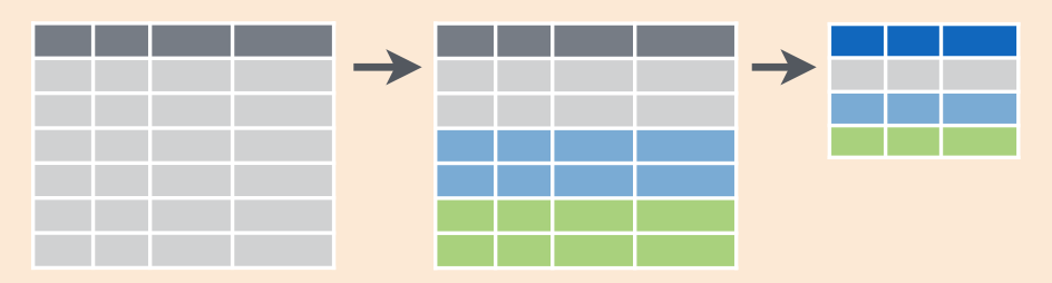
Figure 26.3: Diagram of group_by() and summarize().
Let’s imagine that instead of a single mean temperature for the whole year, you would like 12 mean temperatures, one for each of the 12 months separately. In other words, we would like to compute the mean temperature split by month. We can do this by “grouping” temperature observations by the values of another variable, in this case by the 12 values of the variable month. Run the following code:
summary_monthly_temp <- weather %>%
  group_by(month) %>%
  summarize(mean = mean(temp, na.rm = TRUE),
            std_dev = sd(temp, na.rm = TRUE))
summary_monthly_temp
# A tibble: 12 × 3
month mean std_dev
<int> <dbl> <dbl>
1 1 35.6357 10.2246
2 2 34.2706 6.98238
3 3 39.8801 6.24928
4 4 51.7456 8.78617
5 5 61.795 9.68164
6 6 72.184 7.54637
7 7 80.0662 7.11990
8 8 74.4685 5.19161
9 9 67.3713 8.46590
10 10 60.0711 8.84604
11 11 44.9904 10.4438
12 12 38.4418 9.98243This code is identical to the previous code that created summary_temp, but with an extra group_by(month) added before the summarize(). Grouping the weather dataset by month and then applying the summarize() functions yields a data frame that displays the mean and standard deviation temperature split by the 12 months of the year.
It is important to note that the group_by() function doesn’t change data frames by itself. Rather it changes the meta-data, or data about the data, specifically the grouping structure. It is only after we apply the summarize() function that the data frame changes.
For example, let’s consider the diamonds data frame included in the ggplot2 package. Run this code:
# A tibble: 53,940 × 10
   carat cut       color clarity depth table price     x     y     z
   <dbl> <ord>     <ord> <ord>   <dbl> <dbl> <int> <dbl> <dbl> <dbl>
 1  0.23 Ideal     E     SI2      61.5    55   326  3.95  3.98  2.43
 2  0.21 Premium   E     SI1      59.8    61   326  3.89  3.84  2.31
 3  0.23 Good      E     VS1      56.9    65   327  4.05  4.07  2.31
 4  0.29 Premium   I     VS2      62.4    58   334  4.2   4.23  2.63
 5  0.31 Good      J     SI2      63.3    58   335  4.34  4.35  2.75
 6  0.24 Very Good J     VVS2     62.8    57   336  3.94  3.96  2.48
 7  0.24 Very Good I     VVS1     62.3    57   336  3.95  3.98  2.47
 8  0.26 Very Good H     SI1      61.9    55   337  4.07  4.11  2.53
 9  0.22 Fair      E     VS2      65.1    61   337  3.87  3.78  2.49
10  0.23 Very Good H     VS1      59.4    61   338  4     4.05  2.39
# ℹ 53,930 more rows
Observe that the first line of the output reads # A tibble: 53,940 x 10. This is an example of meta-data, in this case the number of observations/rows and variables/columns in diamonds. The actual data itself are the subsequent table of values. Now let’s pipe the diamonds data frame into group_by(cut):
# A tibble: 53,940 × 10
# Groups:   cut [5]
   carat cut       color clarity depth table price     x     y     z
   <dbl> <ord>     <ord> <ord>   <dbl> <dbl> <int> <dbl> <dbl> <dbl>
 1  0.23 Ideal     E     SI2      61.5    55   326  3.95  3.98  2.43
 2  0.21 Premium   E     SI1      59.8    61   326  3.89  3.84  2.31
 3  0.23 Good      E     VS1      56.9    65   327  4.05  4.07  2.31
 4  0.29 Premium   I     VS2      62.4    58   334  4.2   4.23  2.63
 5  0.31 Good      J     SI2      63.3    58   335  4.34  4.35  2.75
 6  0.24 Very Good J     VVS2     62.8    57   336  3.94  3.96  2.48
 7  0.24 Very Good I     VVS1     62.3    57   336  3.95  3.98  2.47
 8  0.26 Very Good H     SI1      61.9    55   337  4.07  4.11  2.53
 9  0.22 Fair      E     VS2      65.1    61   337  3.87  3.78  2.49
10  0.23 Very Good H     VS1      59.4    61   338  4     4.05  2.39
# ℹ 53,930 more rows
Observe that now there is additional meta-data: # Groups: cut [5] indicating that the grouping structure meta-data has been set based on the 5 possible levels of the categorical variable cut: "Fair", "Good", "Very Good", "Premium", and "Ideal". On the other hand, observe that the data has not changed: it is still a table of 53,940 \(\times\) 10 values.
Only by combining a group_by() with another data wrangling operation, in this case summarize(), will the data actually be transformed.
# A tibble: 5 × 2
  cut       avg_price
  <ord>         <dbl>
1 Fair        4358.76
2 Good        3928.86
3 Very Good   3981.76
4 Premium     4584.26
5 Ideal       3457.54
If you would like to remove this grouping structure meta-data, we can pipe the resulting data frame into the ungroup() function:
# A tibble: 53,940 × 10
   carat cut       color clarity depth table price     x     y     z
   <dbl> <ord>     <ord> <ord>   <dbl> <dbl> <int> <dbl> <dbl> <dbl>
 1  0.23 Ideal     E     SI2      61.5    55   326  3.95  3.98  2.43
 2  0.21 Premium   E     SI1      59.8    61   326  3.89  3.84  2.31
 3  0.23 Good      E     VS1      56.9    65   327  4.05  4.07  2.31
 4  0.29 Premium   I     VS2      62.4    58   334  4.2   4.23  2.63
 5  0.31 Good      J     SI2      63.3    58   335  4.34  4.35  2.75
 6  0.24 Very Good J     VVS2     62.8    57   336  3.94  3.96  2.48
 7  0.24 Very Good I     VVS1     62.3    57   336  3.95  3.98  2.47
 8  0.26 Very Good H     SI1      61.9    55   337  4.07  4.11  2.53
 9  0.22 Fair      E     VS2      65.1    61   337  3.87  3.78  2.49
10  0.23 Very Good H     VS1      59.4    61   338  4     4.05  2.39
# ℹ 53,930 more rows
Observe how the # Groups: cut [5] meta-data is no longer present.
Let’s now revisit the n() counting summary function we briefly discussed earlier. Recall that the n() function counts rows. This is opposed to the sum() summary function that returns the sum of a numerical variable. For example, suppose we’d like to count how many flights departed each of the three airports in New York City:
# A tibble: 3 × 2
  origin  count
  <chr>   <int>
1 EWR    120835
2 JFK    111279
3 LGA    104662
We see that Newark ("EWR") had the most flights departing in 2013 followed by "JFK" and lastly by LaGuardia ("LGA"). Note there is a subtle but important difference between sum() and n(); while sum() returns the sum of a numerical variable, n() returns a count of the number of rows/observations.
26.3.1 Grouping by more than one variable
You are not limited to grouping by one variable. Say you want to know the number of flights leaving each of the three New York City airports for each month. We can also group by a second variable month using group_by(origin, month):
by_origin_monthly <- flights %>%
  group_by(origin, month) %>%
  summarize(count = n())
by_origin_monthly
# A tibble: 36 × 3
# Groups: origin [3]
origin month count
<chr> <int> <int>
1 EWR 1 9893
2 EWR 2 9107
3 EWR 3 10420
4 EWR 4 10531
5 EWR 5 10592
6 EWR 6 10175
7 EWR 7 10475
8 EWR 8 10359
9 EWR 9 9550
10 EWR 10 10104
# ℹ 26 more rowsObserve that there are 36 rows to by_origin_monthly because there are 12 months for 3 airports (EWR, JFK, and LGA).
Why do we group_by(origin, month) and not group_by(origin) and then group_by(month)? Let’s investigate:
by_origin_monthly_incorrect <- flights %>%
  group_by(origin) %>%
  group_by(month) %>%
  summarize(count = n())
by_origin_monthly_incorrect
# A tibble: 12 × 2
month count
<int> <int>
1 1 27004
2 2 24951
3 3 28834
4 4 28330
5 5 28796
6 6 28243
7 7 29425
8 8 29327
9 9 27574
10 10 28889
11 11 27268
12 12 28135What happened here is that the second group_by(month) overwrote the grouping structure meta-data of the earlier group_by(origin), so that in the end we are only grouping by month. The lesson here is if you want to group_by() two or more variables, you should include all the variables at the same time in the same group_by() adding a comma between the variable names.
26.4 Conclusion
When I first learned about grouping and summarizing variables in R, it seemed like a lot of work for benefits that weren’t always clear. The more time I spend with these concepts, though, the easier they get, and the more valuable they become. These days, in fact, grouping and summarizing are one of the first things I do whenever I get a new dataset to work with. Descriptive statistics can be a great way to get a quick feel for your data, and these functions are helpful for calculating them!